Branding Project: Logo Suite for Rustic Spunk Decor
Caitlynn is in an exciting season for her business. She has just decided to transition her side-hustle into a framework that fits her family even better. With new things on the horizon for her and her husband, she wanted to focus on pursuing a new-found passion of clean living.
While she will be changing up the name and theme of her business, I still had to share her branding project and the fun logo I designed for her back when she was selling handmade candles and nature-inspired home decor.
The Story Behind Rustic Spunk Decor
People who love creating things often find themselves becoming more and more surrounded by what they make. And that’s just where Caitlynn Brennan of Rustic Spunk Decor found herself when she set out to open an online shop.
After deepening a strong love for making decor products from the many DIY projects for her wedding, Caitlynn decided to jump into the small business world and open a shop to share her creations with others.
The many DIY projects for her wedding deepened her strong love for making decor items, and Caitlynn decided to jump into the small business world and open a shop to share her creations with others.
As the brand name suggests, her products featured an overall rustic feel with elements of nature and hints of steampunk. From DIY burlap flowers and moss terrarium kits, to hand-poured candles, she set out to make nature-inspired decor accessible for the room stylist and crafter alike.
Pinpointing a Design Strategy
After chatting with Caitlynn about her goals and overall vision of RSD, I was instantly bursting with ideas for bringing the visual side of her brand to life.
Caitlynn wanted a brand identity that matched the style of her products: handmade home goods that featured an overall rustic style with natural elements and colors. So from the start, we knew nature would take the spotlight in the design.
To dig even deeper, I gave Caitlynn a client workbook to help her think about the details goals, and inner workings of her brand so we could hone-in on a meaningful and intentional direction for the design.
Having my clients dig even deeper into their business with a workbook allows me to create a brand identity that is strategic and that fits with the essence of their business.
The Design Process
After reviewing all of the details Caitlynn included about her brand, I was able to pinpoint the best direction for a design that would enhance the core of her business.
Then, it was time to get to work!
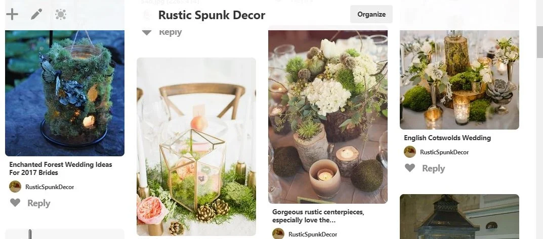
First off, I created a secret board on Pinterest so Caitlynn could fill it with images that embodied her products and visual aesthetic of her brand.
After Caitlynn pinned about 65 images, I further establish the visual direction by solidifying the overarching concepts.
I looked through the images and zeroed in on the recurring styles, themes, and colors. And I chose a handful of photos that best represented those concepts.
Next, I pulled those images into Adobe Illustrator to create a unified brand inspiration board to guide the rest of the design process.
In the inspiration board, I included a few colors from the photos that worked well together as a jumping-off point for the colors in the brand design.
Once Caitlynn approved the Inspiration Board and assured me we were on the right path, I got started with my favorite part: sketching!
The moment I begin drawing preliminary logo ideas, my creativity kicks into full gear and the ideas come flooding in. This is why I love working with one client at a time--because I can put my full focus and excitement into creating the perfect design solutions for a brand.
I wanted to include nature in the design while also hinting at home decor. And I knew the perfect font would be a balance of classic with a hint of funky flair.
After eight pages of sketches and ideas, I focused on the strongest logo concepts and developed them a little bit further.
Then, I presented them to Caitlynn to get her input, and I asked her to choose the option that was the best fit and the most impactful for her business.
Can you guess which one she chose?
We both decided on the final option for several reasons . . .
Overall, we loved the how the interchangeable detail of the leaf and flame worked together in rhythm with the heartbeat of RSD’s theme and nature-inspired products.
A leaf was the perfect detail to feature because it was one of the most common nature elements throughout Caitlynn’s products and photography.
The leaf detail also created a flame, and the simple lines along the bottom, sides, and top formed the shape of a tealight candle.
Since Caitlynn was planning to focus of her product line towards candles, it was perfect to showcase them in her logo, too.
The simple form and dual-functioning element of the leaf and flame create a strong logo without cluttering the design by trying to include both elements somehow.
And combining them in a clever way meant we didn’t have to pick and choose between the two crucial symbols for the brand.
Next, I refined the font and candle shape, and I added Rustic Spunk Decor’s new brand colors to bring the design to life.
I also created a few variations to make her logo more functional for her packaging, photos, and social media platforms:
And then, Rustic Spunk Decor’s new logo suite was ready to meet the world!
I’m so pleased with how the design turned out. This was such a fun project, and Caitlynn was a dream client to work with. I’m looking forward to our next collaboration.
I’ll be having Caitlynn on the blog in later this month for my new weekly’ blog series featuring creative entrepreneurs. She will be sharing more about her business’s transition and what she is now focusing on during this new busy season in her life. Stay tuned!
I hope you enjoyed this blog post and seeing my process, the strategy, and the work that goes into designing a logo. I will show you even more details of my brand and website design process in the weeks to come.
Brand + Website Design
Interested in working with me to create a one-of-a-kind visual brand identity for your creative business? Click the button to learn more about my unique design process and package.
